
Runner World Redesign Review: A Better Daily Read for Active Runners

We independently review everything we recommend. When you buy through our links, we may earn a commission which is paid directly to our Australia-based writers, editors, and support staff. Thank you for your support!

A running publication has to move at two speeds. It needs to deliver a race result or gear headline in seconds, then slow down when a reader wants useful context about training, recovery or the reason a story matters. The redesigned Runner World handles that change of pace unusually well.
The new site feels less like an endless blog feed and more like a compact digital magazine built around the way runners actually read. There is current news for a quick pre-run check, practical guidance for the next training block, and enough source information to show where each report or recommendation comes from.
We reviewed the homepage, story pages, evidence guide library, search, navigation and mobile layout. The verdict is straightforward: this is a more useful daily read for active runners, not simply a visual reskin.
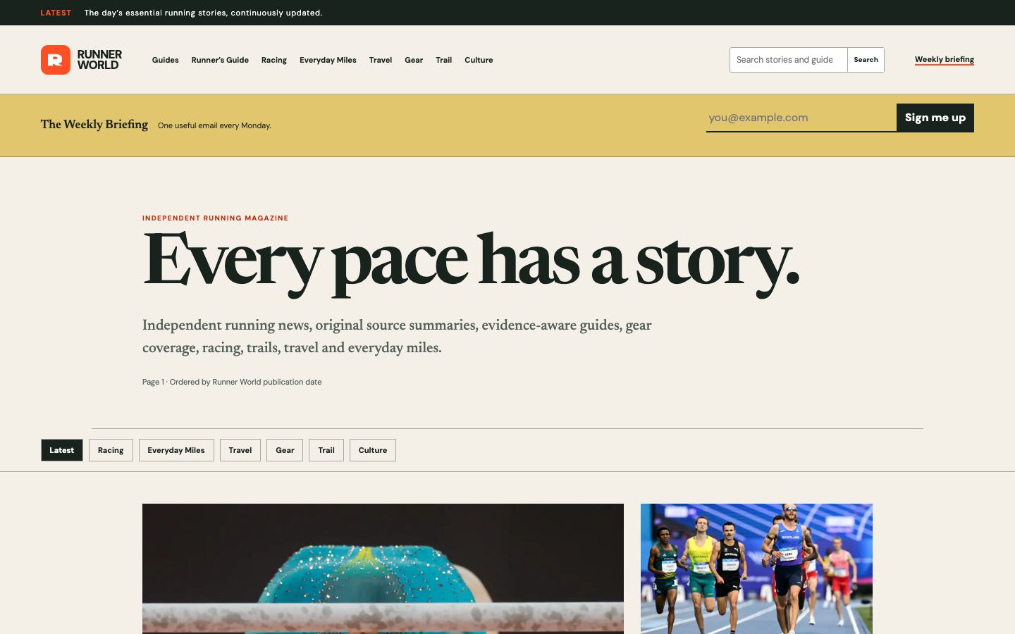
What the Runner World redesign changes
The redesign gives every part of the publication a clearer job. The homepage leads with a large editorial statement, followed by category controls and a visual news grid. The restrained cream, green and orange palette is distinctive without competing with story photography, while the combination of serif headlines and clean sans-serif labels makes the page easy to scan.
More importantly, the information architecture now reflects the breadth of running rather than treating every reader as a road racer. The main navigation separates Racing, Everyday Miles, Travel, Gear, Trail and Culture, with dedicated Guides and Runner’s Guide sections alongside them. That makes it quicker to find something relevant whether the day’s priority is a race result, a shoe question, a safer trail route or simply staying consistent.
- Source-labelled news briefs identify the original publisher and link readers to the complete report.
- Evidence-aware guides include visible review dates, claim-level citations and clear limits on what the research can establish.
- The Runner’s Guide organises fundamentals around starting, gear, training, recovery, racing, trails and travel.
- Search and category filters reduce the effort required to move from a broad interest to a relevant story.
- The Weekly Briefing offers one concise Monday email for readers who do not want to monitor a feed every day.
Why it works for an active runner
Most runners do not sit down to read running news in one long session. We check a result while waiting for a GPS watch to lock, look up a niggle after a shower, or compare advice before changing the next week’s plan. Runner World now supports those short, intent-driven visits.
The latest-story cards provide a headline, category, source, summary and date without forcing a click. That is enough information to decide whether a report deserves more time. On the story page, the original publisher remains prominent and the source link is repeated in context. For readers tired of summaries that blur reporting, commentary and aggregation, that transparency is a meaningful benefit.
The guide library is the stronger long-term feature. Topics such as cadence, Zone 2 running, strength training, shoe choice, pre-run nutrition and running after joint surgery are easy to oversimplify. Runner World does not present one universal number or routine as the answer. Its guides distinguish useful findings from uncertainty and expose the research behind important claims.
That approach is valuable to a runner because training decisions compound. A dramatic headline can influence a week; a poorly qualified injury claim can influence a season. Visible evidence dates and limitations make it easier to use an article as a starting point without mistaking it for individual coaching or medical advice.
A better experience on the phone
The mobile execution is particularly relevant because running content is often read away from a desk. At a narrow phone width, the full navigation becomes a simple menu, category controls remain easy to tap, and story cards settle into a true single column. Headlines retain their visual impact without pushing the page wider than the screen.
Text contrast is strong, body copy remains comfortably sized and the page does not depend on tiny metadata or hover effects. Search, the weekly briefing and the main content also have clear accessible labels. These details make the site easier to use with one hand after a run, in bright outdoor light or while moving between sessions.
The newsletter panel occupies a noticeable amount of space near the top on mobile. Regular readers who always browse the latest headlines may wish it were slightly less prominent, but the form itself is short and direct rather than a disruptive pop-up.
Small editorial details that build trust
Runner World describes itself as an independent digital magazine, and the redesign gives that claim visible support. News cards name their source. Story pages distinguish a brief from an original report. Image captions explain attribution. Editorial standards cover corrections, AI-assisted summaries, health evidence, image rights and commercial independence in plain language.
The result is a reading experience that asks for less blind trust. A reader can understand what kind of article is on the page, when it was published, where its underlying information came from and when an evidence guide was last checked. That is stronger service journalism than simply placing a polished template around familiar content.
The visual system helps too. Generous spacing keeps the homepage from feeling frantic, the orange accents create useful wayfinding, and the large editorial type gives the publication a recognisable voice. It looks professional without becoming too precious to use every day.
Where the site can improve next
The main opportunity is story clustering. When several publishers cover the same major race result, near-duplicate headlines can appear close together in the latest feed. Grouping those reports around one event would make the homepage feel more varied while still preserving different sources and perspectives.
Depth will also matter as the redesign matures. The guide framework is strong, but runners will benefit most if those pages continue to be reviewed as evidence changes and if gear, trail and travel sections develop the same level of practical organisation. The visible evidence-check dates suggest the right process is already in place.
Runner World redesign verdict
The redesigned Runner World succeeds because it improves the decision between reading now and saving something for later. Fast stories are genuinely scannable. Longer guides show their working. Navigation follows real runner interests, and the mobile layout remains readable without stripping away context.
For an active runner, that adds up to a publication worth keeping in the weekly rotation. It can provide a quick snapshot of the sport before an easy run, a deeper answer during recovery, or a useful trail into the original reporting and research when the topic deserves more scrutiny.
Explore the redesigned Runner World website and choose the section that best matches your next run.
